Interacting with APIs: Covid19api
Yan Liu 2021/9/30
This document is a vignette to show how to retrieve data from an API. To demonstrate, I’ll be interacting with the API. I’m going to build a few functions to interact with some of the endpoints and explore some of the data I can retrieve.
Requirements
To use the functions for interacting with the Covid19 API, I used the following packages:
tidyverse: Tons of useful features for data manipulation and visualizationjsonlite: API interaction
In addition to those packages, I used the following packages in the rest of the document:
httr: Useful tools for working with HTTPrmarkdown: Convert R Markdown documentslubridate: Work with Date-time datacountrycode: Standardize country names and convert different types of country codesrworldmap: Enables mapping of country level data
API Interaction Functions
Here is where I define the functions to interact with the Country Names and Covid cases summary as well as some helper functions.
Find country names
This is a helper function to help matching un-standardized country names from user input to the standardized names provided API. We use pattern match function and allow users to input multiple names as a vector in one time.
match_country_name <- function (name) {
  #get the list of available countries
  countries <- fromJSON("https://api.covid19api.com/countries")
  country_names <- countries$Country
  name_all <-
    countries[grep(paste(name, collapse = "|"), country_names, ignore.case =
                     TRUE), ]
  return(name_all)
}
Total cases
This function retrieves data from “summary” endpoint. We can get the total number of confirmed cases and deaths from the first case until today in selected countries, sorted by number confirmed cases from high to low. If no specific country name is selected, the function will give the whole list of all available countries and their data. If the input country name is not unique, the function will give the results of all possible matched countries. If the input name cannot be matched to any country, it will gives error message to ask user check the name from the list of all countries.
summary_total <- function(country = "all") {
  # Get data from the summary endpoint
  summary <- fromJSON("https://api.covid19api.com/summary")
  # Select the data part from JSON
  all <- summary$Countries

  if (country[1] != "all") {
    # match input country names to get their unique Slug name
    country_slug <- match_country_name(country)$Slug
    # Give error message if the country names cannot be pattern matched to
    # any of the available countries
    if (length(country_slug) == 0) {
      message <- paste(
        "ERROR: Argument for country was not found.",
        "Try summary_total('all') to find the country you're looking for."
      )
      stop(message)
    }
    else {
      select_country <- all %>%
        # Filter the selected countries
        filter(Slug %in% country_slug) %>%
        select(Country, TotalConfirmed, TotalDeaths, Date) %>%
        # Change the data type from character to date format
        mutate(Date = as_date(Date)) %>%
        # Sorted results by number of confirmed cases
        arrange(desc(TotalConfirmed))
    }
  }

  # Give data of all countries
  else {
    select_country <- all %>%
      select(Country, TotalConfirmed, TotalDeaths, Date) %>%
      mutate(Date = as_date(Date)) %>%
      arrange(desc(TotalConfirmed))
  }
  return(select_country)
}
New cases
This function retrieves data from “country” endpoint. The original data gives cumulative number of confirmed cases and death on all days. I wrote this function to calculate number of new cases and death on each day in a given period of one country. Enter start and end date as YYYY-MM-DD, ranging from 2010-01-22 untill today. Country name can only be one unique hit. If not, an error message will be given and provides the list of possible names.
new_period <- function(country, start, end) {
  # match input country names to get their unique Slug name
  country_slug <- match_country_name(country)$Slug


  # Error message for invalid input of country names
  if (length(country_slug) == 0) {
    message <-
      paste(
        "ERROR: Argument for country was not found. Try summary_total('all') to find the country you're looking for:",
      )
    stop(message)
  }

  # if country name has multiple hits, ask the user select one from the list of possible county names
  else if (length(country_slug) > 1) {
    message <- paste(
      "ERROR: Argument for country was not unique.",
      "Please select one from the list:",
      paste(
        grep(
          country,
          country_names,
          ignore.case = TRUE,
          value = TRUE
        ),
        collapse = '; '
      )
    )
    stop(message)
  }

  else {
    # Get data from the country endpoint
    all_days <-
      fromJSON(paste(
        "https://api.covid19api.com/total/country",
        country_slug,
        sep = "/"
      ))

    # process data
    period <- all_days %>%
      select(Country, Confirmed, Deaths, Date) %>%
      mutate(Date = as_date(Date)) %>%
      filter(Date >= ymd(start) - 1  & Date <= end) %>%
      # calculate number of new cases using lag function
      mutate(new_case = Confirmed - lag(Confirmed)) %>%
      mutate(new_death = Deaths - lag(Deaths)) %>%
      slice(-1L) %>%
      select(Country, Date, new_case, new_death)
  }

  return(period)
}
Average
Since cases may not be reported daily (etc. skipping weekend or holiday) in all country, the average number of new cases in ~7 days could be a better way to show the trend of increase and better for making a smooth line in a time series plot, than daily new cases data. This function calculate the average new case number in the past n days from the day of first case until today. The default n is 7, but can be modified to be other numbers.
new_average <- function(country, window = 7) {
  # match input country names to get their unique Slug name
  country_slug <- match_country_name(country)$Slug

  # Error message for invalid input of country names
  if (length(country_slug) == 0) {
    message <-
      paste(
        "ERROR: Argument for country was not found. Try summary_total('all') to find the country you're looking for:",
      )
    stop(message)
  }

  # if country name has multiple hits, ask the user select one from the list of possible county names
  else if (length(country_slug) > 1) {
    message <- paste(
      "ERROR: Argument for country was not unique.",
      "Please select one from the list:",
      paste(
        grep(
          country,
          country_names,
          ignore.case = TRUE,
          value = TRUE
        ),
        collapse = '; '
      )
    )
    stop(message)
  }

  else {
    # Get data from the country endpoint from day one
    from_dayone <-
      fromJSON(
        paste(
          "https://api.covid19api.com/total/dayone/country",
          country_slug,
          sep = "/"
        )
      )

    average <- from_dayone  %>%
      select(Country, Confirmed, Deaths, Date) %>%
      mutate(Date = as_date(Date)) %>%
      mutate(new_case_average = (Confirmed - lag(Confirmed, window)) / window) %>%
      mutate(new_death_average = (Deaths - lag(Deaths, window)) / window) %>%
      select(Country, Date, new_case_average, new_death_average) %>%
      filter(!is.na(new_case_average))
  }

  return(average)
}
Data Exploration
Now that we can interact with a few of the endpoints of the Covid API using the functions I wrote above.
First, let’s have a global look of the confirmed cases in a world map.
I used per capita data to better show the outbreak level of COVID cases
all over the world, rather than using the absolute number. Population
data is retrieved from world_bank_pop from tidyr. ISO2 country code
from the COVID API is converted to ISO3 before merging to the population
data.
#get the list of available countries
countries <- fromJSON("https://api.covid19api.com/countries")
# Get population data in 2017 from world bank
pop <- world_bank_pop %>%
  filter(indicator == 'SP.POP.TOTL') %>%
  select(country, '2017') %>%
  rename(population = '2017')

# Merge with country names from API
countries_pop <- countries %>%
  mutate(iso3c = countrycode(countries$ISO2, origin = "iso2c", destination = "iso3c")) %>%
  # add continent column
  mutate(continent = countrycode(countries$ISO2, origin = "iso2c", destination = "continent")) %>%
  # add region column
  mutate(region = countrycode(countries$ISO2, origin = "iso2c", destination = "region")) %>%
  left_join(pop, by = c("iso3c" = "country"))

# Merge with total cases data
total_all <- summary_total('all')

total_all_pop <- total_all %>%
  left_join(countries_pop, by = "Country") %>%
  mutate(cases_per1k = TotalConfirmed / population * 1000) %>%
  mutate(mortality = TotalDeaths / TotalConfirmed * 100) %>%
  # Only keep the country with >100 cases
  filter(TotalConfirmed > 100)

# basic summary statistics
total_summary <- total_all_pop %>%
  summarise(
    n_country = n(),
    min_case = min(cases_per1k, na.rm = T),
    max_case = max(cases_per1k, na.rm = T)
  )
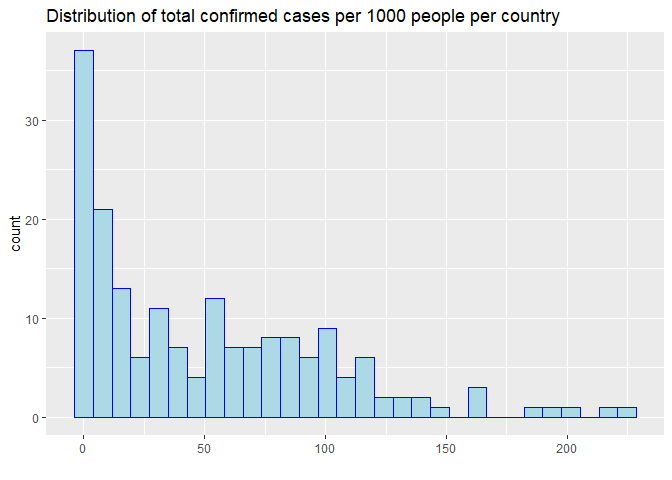
Among 184 countries with more than 100 confirmed COVID-19 cases, the number of cases per 1000 people ranges from 0 to 225. The country with the largest number of confirmed cases is United States of America, where 134 COVID cases has been confirmed per 1000 people.
The distribution of total confirmed cases per 1000 people.The distribution of highly right skewed, suggesting that a few countries has been hit by the pandemic badly.
p1 <- ggplot(total_all_pop, aes(x=cases_per1k)) +
  geom_histogram(color='blue',fill='lightblue')+
  ggtitle('Distribution of total confirmed cases per 1000 people per country')+
  xlab('')
p1
I summarized the confirmed cases per capita in a country by continent. Europe has a significant higher confirmed cases overall probobly due to the more comprehensive covid-19 test.
# Get the summary statistics for case_per1k
total_summary_continent <- total_all_pop %>%
  filter(!is.na(continent)) %>%
  group_by(continent) %>%
  summarize(
    n = n(),
    "1st Quartile" = quantile(cases_per1k, 0.25, na.rm = TRUE),
    "Median" = quantile(cases_per1k, 0.5, na.rm = TRUE),
    "3rd Quartile" = quantile(cases_per1k, 0.75, na.rm = TRUE),
    "Max" = max(cases_per1k, na.rm = T),
  )

# display the summary statistics
knitr::kable(total_summary_continent ,
             caption="Summary Statistics for confirmed case per 1000 people by continent",
             digits=0)
| continent | n | 1st Quartile | Median | 3rd Quartile | Max |
|---|---|---|---|---|---|
| Africa | 54 | 2 | 4 | 12 | 225 |
| Americas | 35 | 33 | 45 | 77 | 134 |
| Asia | 47 | 9 | 25 | 87 | 195 |
| Europe | 43 | 66 | 85 | 116 | 214 |
| Oceania | 4 | 2 | 4 | 18 | 57 |
Summary Statistics for confirmed case per 1000 people by continent
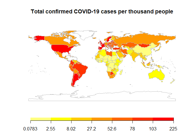
To better view the spread of COVID, I drew a country heatmap to show the total confirmed cases per 1000 people all over the world in a map. We can see that North America and Europe has much more cases per capita than East Asia and Australia.
# Create data for mapping
joinData <- joinCountryData2Map(total_all_pop ,
                                joinCode = "ISO2",
                                nameJoinColumn = "ISO2")
## 183 codes from your data successfully matched countries in the map
## 1 codes from your data failed to match with a country code in the map
## 58 codes from the map weren't represented in your data
# Map the data
case_capita <-
  mapCountryData(
    joinData,
    nameColumnToPlot = "cases_per1k",
    catMethod = "quantiles",
    addLegend = F,
    mapTitle = "Total confirmed COVID-19 cases per thousand people"
  )
# customize the legend
do.call(
  addMapLegend,
  c(
    case_capita,
    legendWidth = 0.5,
    legendLabels = "all",
    legendIntervals = 'page',
    sigFigs = 3
  )
)
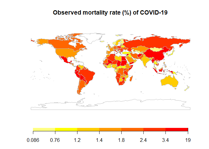
 Then, we calculate the
mortality rate (death/confirmed) and draw a world heatmap of it. The
mortality rate is quite different all over the world. One possible
reason can be under-report of confirmed cases. For example, the
mortality rate in Africa is very unevenly distributed. The observed
mortality rate in countries with low testing capacity may be very
different from the true value. Another reason could be the availability
of medical care, affecting the true mortality rate of COVID-19. The
developing countries generally have a higher mortality rate than
developed countries.
Then, we calculate the
mortality rate (death/confirmed) and draw a world heatmap of it. The
mortality rate is quite different all over the world. One possible
reason can be under-report of confirmed cases. For example, the
mortality rate in Africa is very unevenly distributed. The observed
mortality rate in countries with low testing capacity may be very
different from the true value. Another reason could be the availability
of medical care, affecting the true mortality rate of COVID-19. The
developing countries generally have a higher mortality rate than
developed countries.
# Map the data in the same way as for the case per capita
joinData <- joinCountryData2Map( total_all_pop ,
                                 joinCode = "ISO2",
                                 nameJoinColumn = "ISO2")
## 183 codes from your data successfully matched countries in the map
## 1 codes from your data failed to match with a country code in the map
## 58 codes from the map weren't represented in your data
mortality_map<-mapCountryData( joinData, nameColumnToPlot="mortality", addLegend=F, catMethod="quantiles",mapTitle = "Observed mortality rate (%) of COVID-19")
do.call(addMapLegend,c(mortality_map,legendWidth=0.5,legendLabels="all",legendIntervals='page',sigFigs=2))
 I categorized mortality
as low (<1%), medium (between 1% to 3%) and high (>3%). Table
below show the counts of countries with low/medium/high mortality by
continent. Africa has the highest mortality rate which correspond with
the pattern shown in the heat map above.
I categorized mortality
as low (<1%), medium (between 1% to 3%) and high (>3%). Table
below show the counts of countries with low/medium/high mortality by
continent. Africa has the highest mortality rate which correspond with
the pattern shown in the heat map above.
# categorize mortality rate into low/medium/high groups
total_mortality_continent <- total_all_pop %>%
  filter(!is.na(continent)) %>%
  mutate(mortality_cat = cut(
    mortality,
    breaks = c(-Inf, 1, 3, Inf),
    labels = c("low (<1%) ", "medium (1%~3%) ", "high (>3%) ")
  ))

# Display the count of countries by continent
knitr::kable(table(total_mortality_continent$continent, total_mortality_continent$mortality_cat),
             caption="Counts of countries with low/medium/high mortality rate by continent")
| low (<1%) | medium (1%~3%) | high (>3%) | |
|---|---|---|---|
| Africa | 10 | 30 | 14 |
| Americas | 5 | 24 | 6 |
| Asia | 17 | 23 | 7 |
| Europe | 10 | 28 | 5 |
| Oceania | 1 | 3 | 0 |
Counts of countries with low/medium/high mortality rate by continent
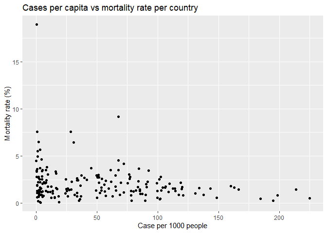
I made a scatter plot of case per capita versus the mortality. Surprisingly, we did not see a clear correlation between them. The observed morality is not higher in the countries with higher cases per capita. As I stated above, the observed mortality in some countries may not reflect the truth.
p2 <- ggplot(total_all_pop, aes(x=cases_per1k,y=mortality)) +
  geom_point()+
  ggtitle('Cases per capita vs mortality rate per country')+
  xlab('Case per 1000 people')+
  ylab('Mortality rate (%)')
  ylim(0,10)
## <ScaleContinuousPosition>
##  Range:
##  Limits:    0 --   10
p2
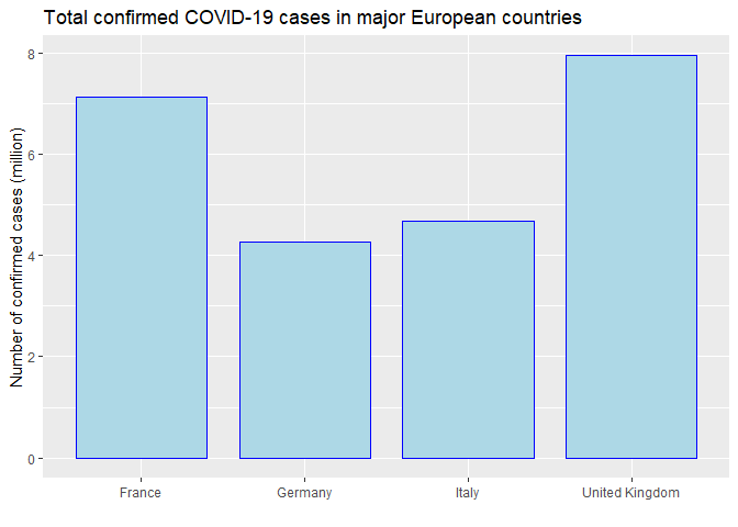
Now I would like to look at specific countries that I’m interested. First, I got total number of confirmed cases in a list of interested countries. I used bar plot comparing the confirmed cases among those countries. France and UK has higher total confirmed cases among the four European countries.
country_select <- c("France", "Germany", "United Kingdom", "Italy")
ds_total <- summary_total(country = country_select) %>%
  mutate(confirmed_m = TotalConfirmed / 1000000)

p1 <-
  ggplot(data = ds_total, aes(x = Country, y =
                                confirmed_m)) +
  geom_bar(
    stat = "identity",
    color = 'blue',
    fill = 'lightblue',
    width = 0.8
  ) +
  ggtitle('Total confirmed COVID-19 cases in major European countries') +
  xlab('') +
  ylab('Number of confirmed cases (million)')
p1
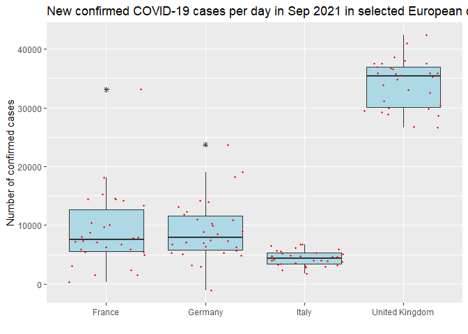
 Then I compare new cases
per day in last month (i.e. 2021-09-01 to 2021-09-30) among the
interested countries. UK had the most new cases among the four
countries.
Then I compare new cases
per day in last month (i.e. 2021-09-01 to 2021-09-30) among the
interested countries. UK had the most new cases among the four
countries.
a <- lapply(country_select,new_period, start="2021-09-01",end="2021-09-30")
new_cases_selected <- do.call(rbind,a)

p3 <- ggplot(new_cases_selected, aes(x=Country, y=new_case)) +
  geom_boxplot(outlier.shape = 8,fill="lightblue") +
  geom_jitter(color='red',size=0.8)+
  ggtitle('New confirmed COVID-19 cases per day in Sep 2021 in selected European countries')+
  xlab('')+
  ylab('Number of confirmed cases')
p3
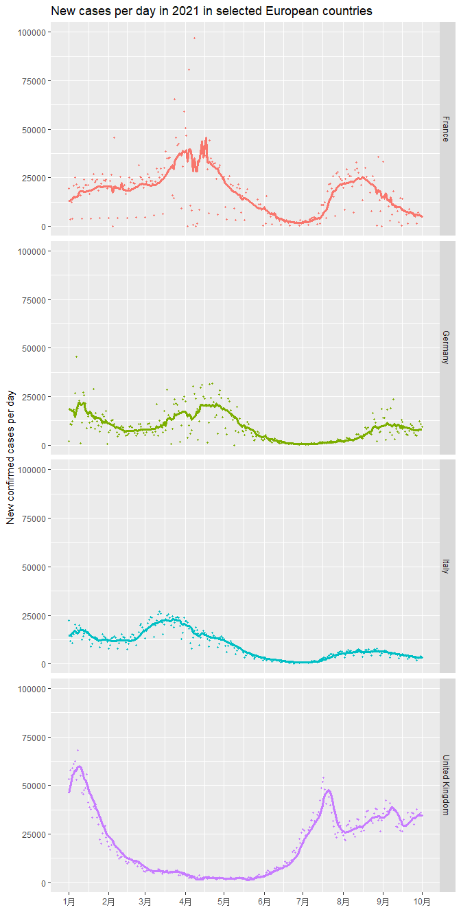
At last, I made time-series plot for the countries I interested. I plotted scatter plot of new cases in 2021 and overlay a time series line of the 7-day average of new cases. We can observe the trend of COIVD-19 in those countries clearly. For example, in UK, the case number drops significantly from Jan to May, but then has a new wave of new cases staring from June 2021.
b <- lapply(country_select,new_period, start="2021-01-01",end="2021-10-01")
new_cases<- do.call(rbind,b)

c <- lapply(country_select,new_average)
new_ave<- do.call(rbind,c)

new_all <- left_join(new_cases,new_ave,by= c("Country", "Date")) %>%
  mutate(mortality_rate = new_death_average/new_case_average*100) %>%
  filter(new_case_average>0)


p4 <- ggplot(new_all,aes(x=Date,color=factor(Country))) +
  geom_point(aes(y=new_case),size=0.8)+
  geom_line(aes(y=new_case_average),size=1.2) +
  scale_x_date(date_breaks='months', date_labels = '%b')+
  facet_grid(Country~.)+
  ylim(0,100000)+
  ggtitle('New cases per day in 2021 in selected European countries')+
  xlab('')+
  ylab('New confirmed cases per day')+
  theme(legend.position='none')
p4
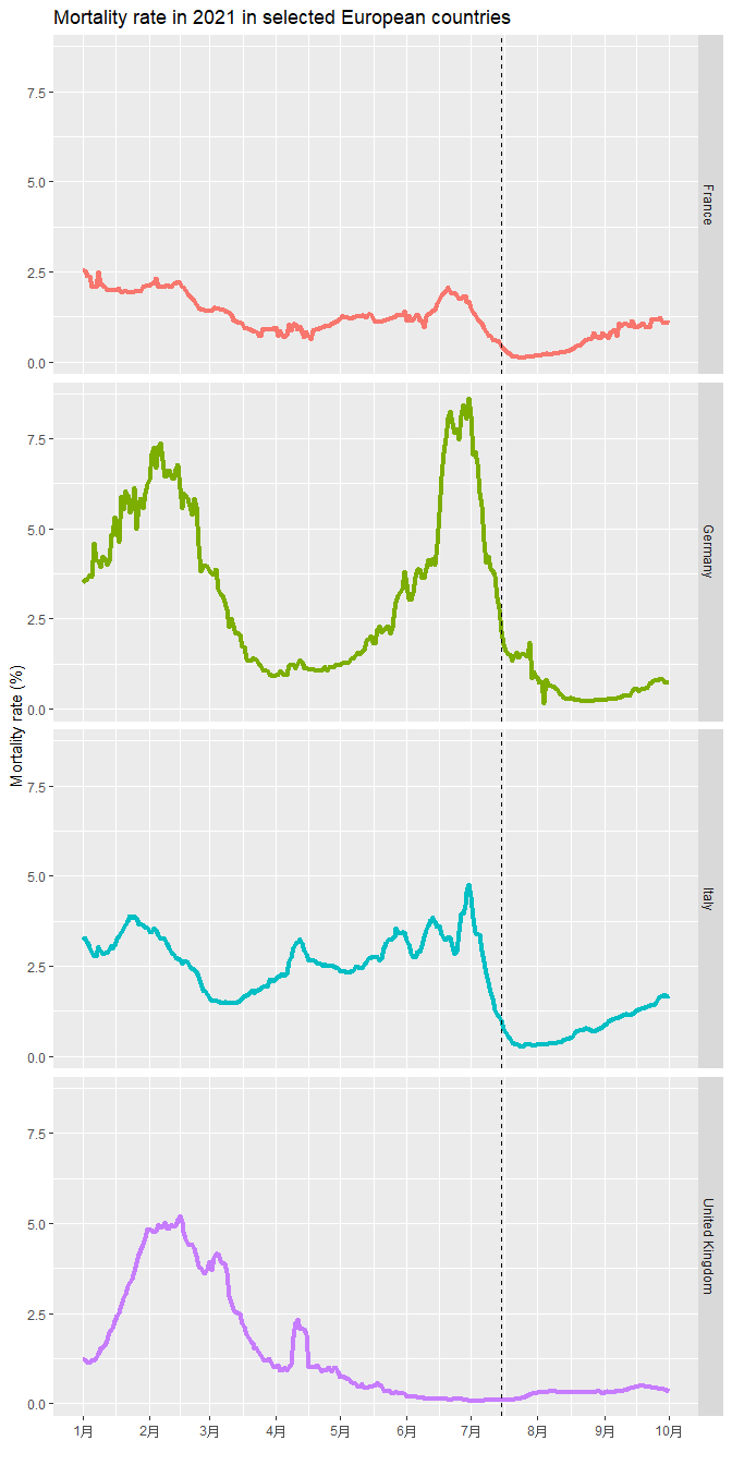
My interested European countries all have COVID vaccine widely available from June this year. About 60% population got vaccinated till July (dash line) in those countries. I made a time-series plot of mortality rate to see if the rate decreased after middle of July. rate in UK climbing to about 60% in UK from Jan to Jun 2021, I plot another time series plot to see if the mortality rate dropped when vaccination rate increased. Based on the figure, the mortality rate decreased in the all the listed European countries after 60% population got vaccinated.
p5<- ggplot(new_all,aes(x=Date,y=mortality_rate,color=factor(Country))) +
  geom_line(size=1.5) +
  geom_vline(xintercept = ymd(20210715),
              color = "black",
              linetype="dashed") +
  scale_x_date(date_breaks='months', date_labels = '%b')+
  facet_grid(Country ~.)+
  ggtitle('Mortality rate in 2021 in selected European countries')+
  xlab('')+
  ylab('Mortality rate (%)')+
  theme(legend.position='none')
p5
 # Wrap-Up
To summarize everything I did in this vignette, I built functions to interact with some of the COVID-19 API endpoints, retrieved some of the data, and explored it using tables, numerical summaries, and data visualization. The results above showed that the mortality rate decreased in the all the listed European countries after 60% population got vaccinated. Surprisingly, we did not see a clear correlation between them. The observed morality is not higher in the countries with higher cases per capita.
Writing this vignette helps me learning how to interact with an API and how to perform a basic exploratory data analysis.